Widgets for Methods
Methods Summary

Methods Summary shows the summary of the method in the selected date range. It applies to the selected screen. For example, if you have selected Methods Overview and Detailed View, the Methods Summary will show a summary for all the methods. But if you select a method in the Detailed View, the summary will show only data for that method.
Here is a list of the metrics shown in the widget:
- Mean Res. Time - The mean response time per method. It is shown in milliseconds.
- Throughput - The number of method calls received per minute. This is an average metric.
- Total Methods - Total number of method calls received, including errors.
Throughput (Requests Per Minute)
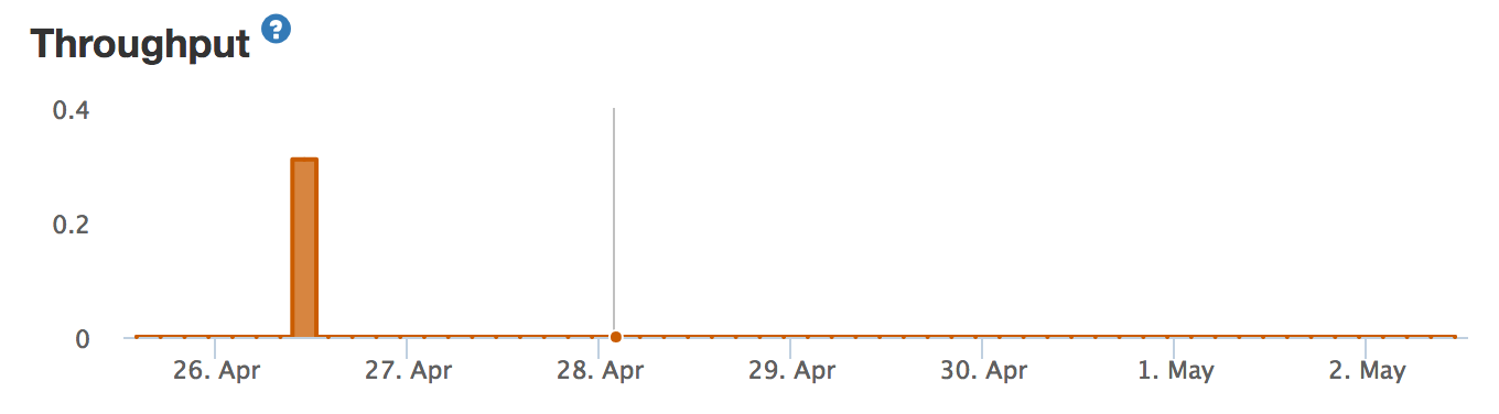
This chart shows throughput for method calls for the selected date range. The X-axis contains the date and the Y-axis contains the requests (method calls) per minute.
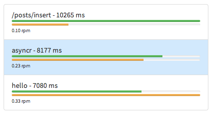
Method Breakdown
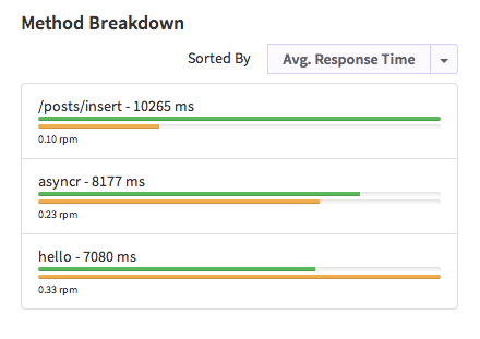
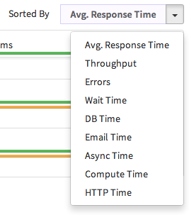
This chart allows you to drill down into the data. It shows a list of methods sorted by metric, which can be selected on top. In the chart above, methods have been sorted by average response time. Options for sorting are shown below.
For each method, two progress bars are shown. The green progress bar represents the sorted metric, while the orange bar represents the throughput of the metric. This throughput bar is shown regardless of the metric you’ve sorted. Sometimes, even though the metric value is high, it may not have a considerable amount of throughput. The throughput bar on this chart enables you to detect that situation.
Another feature of this chart is the ability to select the method. Once you have selected a method, all the other graphs will show data corresponding to the selected method.